Tribe said what? #008
|
Newsletter
|
By James West
Hey friends.
We know it’s been a minute, but the past few weeks have been a whirlwind. Between Speciality & Fine Food Fair, Bread & Jam’s FeelGood Summit, London Packaging Week, and wrapping up a few projects, it's been non-stop at Tribe HQ.
But it’s all been worth it, as of today, we’ve officially signed a new exciting client for a full rebrand (more on that soon ).
Let’s get into what’s been catching our eye lately →
WHAT CAUGHT OUR EYE 👀
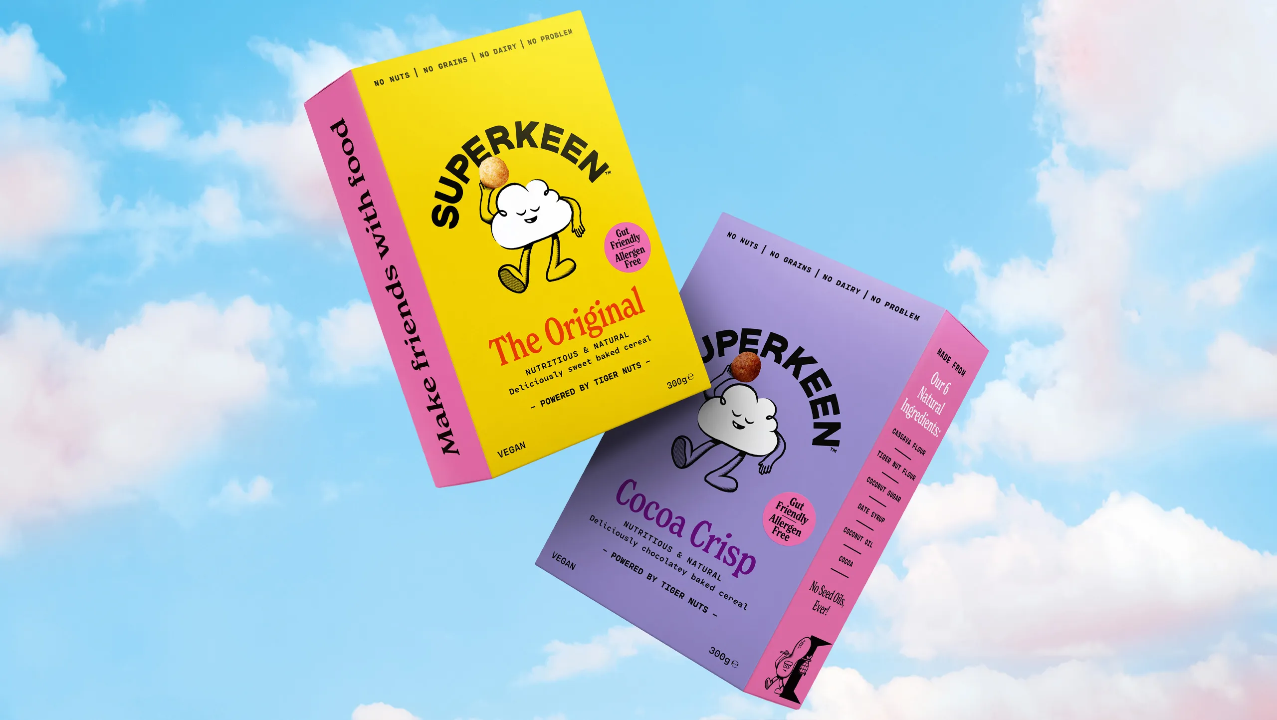
Superkeen Cereal: Clarity that cuts through the noise
Healthy cereal brands love to overexplain with exhaustive lists of claims: protein-packed, gluten-free, sugar-conscious, family-friendly, good-for-your-gut, good-for-your-soul… You get the idea. The result? A cluttered pack that looks more like a PowerPoint slide than breakfast.
Superkeen, designed by B&B Studio, went the opposite way. It’s loud, but in a clean, confident way. Big colour, bold type, and a walking cloud mascot that does more storytelling than a paragraph of copy ever could. It’s bright, cheeky, and instantly recognisable, the kind of brand that makes kids smile and parents trust the shelf.
Why it works:
The mascot builds memory. It gives personality and warmth, an ownable visual cue that connects emotionally, not just functionally.
Confidence in clarity. The design doesn’t hide behind jargon or health halos. You know exactly what you’re getting at a glance.
Energy without chaos. Each flavour pops but still feels part of a system.
Founders take note: the clearer your brand, the less you have to shout. When you truly understand your audience and your point of difference, you can let design do the heavy lifting.
CHALLENGER THINKING 🧠
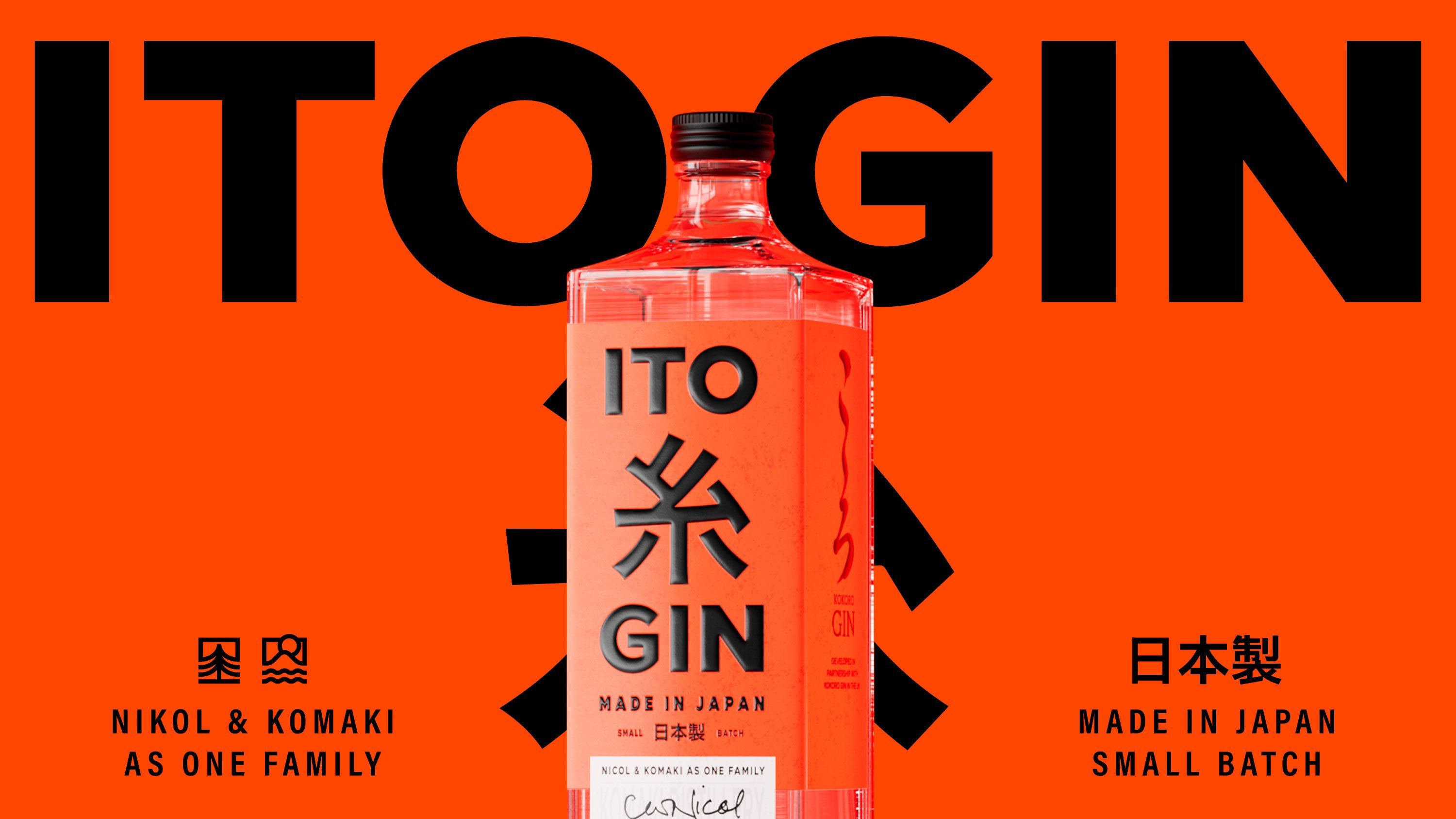
Ito Gin: Redefining what gin looks like
If most gins are whispering about “botanicals” and “freshness,” Ito Gin is shouting craft with conviction.
In a category dominated by green bottles, floral motifs, and heritage cues, Ito Gin goes loud, a searing red label, heavy black type, and a confident grid system that feels more design museum than distillery. It’s bold, graphic, and unapologetically modern.
Red isn’t a colour you associate with gin, and that’s exactly why it works. It forces a double-take. It challenges every preconception of what gin branding “should” look like, while still feeling deeply Japanese in its structure and precision.
Why it’s smart:
Colour as defiance. Choosing red in a sea of botanical greens and blues instantly signals difference. It’s not trying to fit in.
Cultural depth, modern energy. The design nods to Japanese calligraphy and balance, but through a sharper, more contemporary lens.
Typography that owns space. The wordmark doesn’t sit quietly on the label; it is the label. Instant recognition, even from across a bar.
For founders, this is a powerful reminder: if you want to stand out in a tired category, stop mimicking the codes everyone else follows.
You don’t have to throw the rules out, just repaint them in your own colour.
BRAND SMARTS 💥
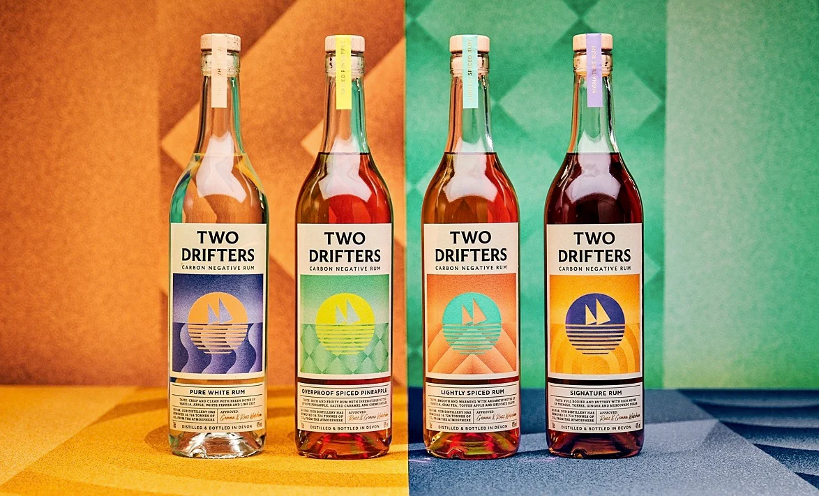
Two Drifters Rum: Rethinking what luxury looks like
At London Packaging Week, I caught one of the Two Drifters Rum founders speaking and one line stuck:
“We’re moving the idea of luxury from indulgence into integrity.”
That’s the shift.
Traditionally, luxury has meant weight, heavy glass, metallic foils, and indulgent excess. But Two Drifters flips that completely. Their version of luxury isn’t about what glitters; it’s about what matters, being a carbon-negative rum brand that’s built sustainability into every decision from day one.
Even the design reflects that thinking. It’s confident but considered. Clean typography, natural tones, and storytelling that’s rooted in truth rather than polish. You feel the brand’s integrity the moment you pick up the bottle.
Why it’s smart:
Purpose made visible. The pack tells the sustainability story without screaming it.
Luxury redefined. It proves that premium doesn’t have to mean excessive; it can mean ethical, intentional, and transparent.
Every detail earns its place. Nothing feels decorative; everything feels deliberate.
For founders, it’s a powerful reminder: luxury is evolving.
People no longer want to feel spoiled; they want to feel smart about what they buy. And the brands that understand that shift will own the next generation of “premium.”
⚡️ Studio Inspiration ⚡️
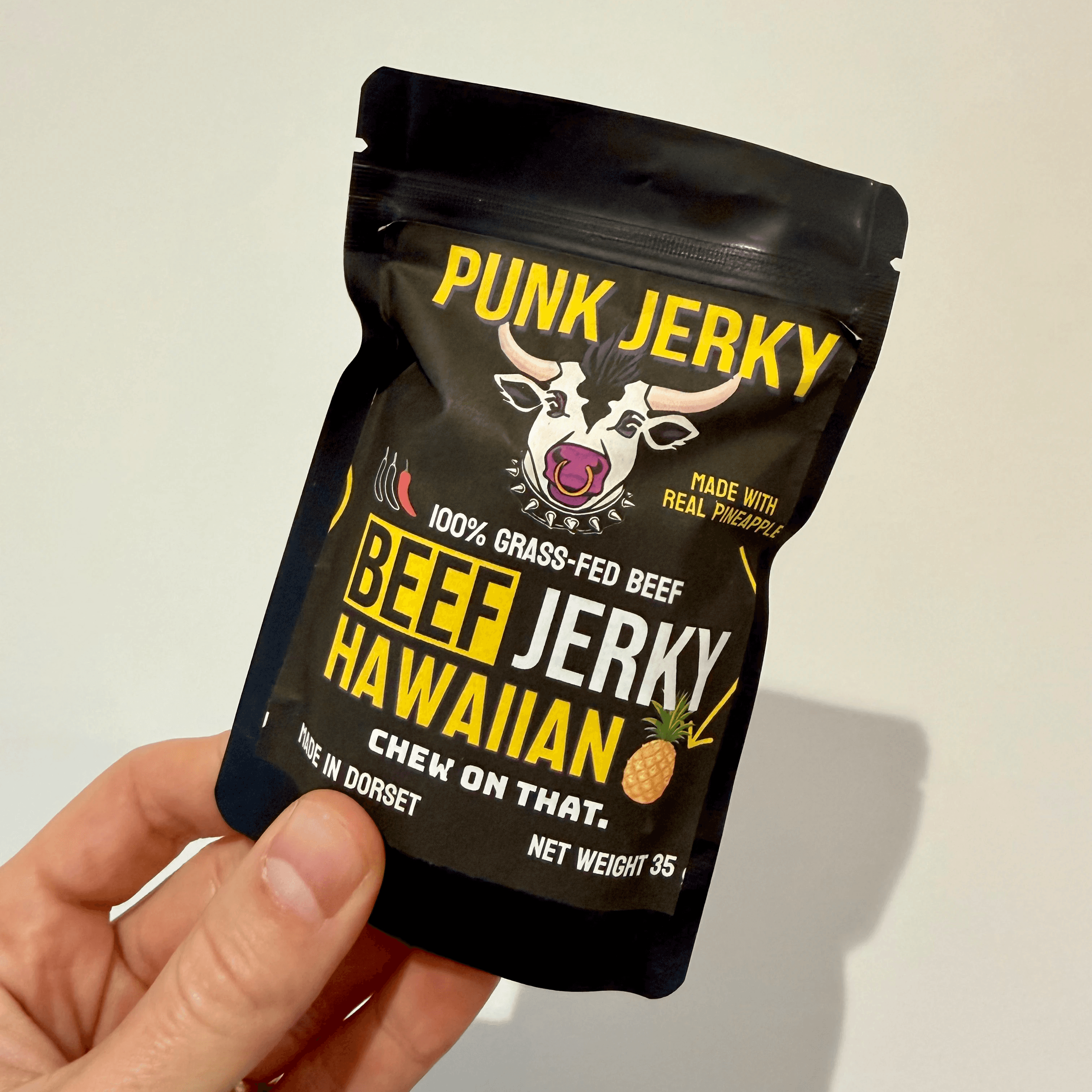
WHAT WE'VE BEEN SCOFFING 🍍
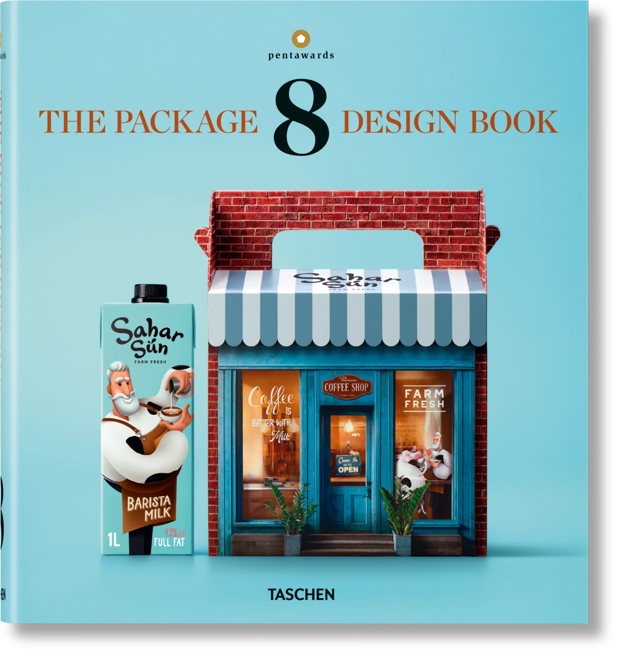
WHAT WE'VE BEEN READING 📚